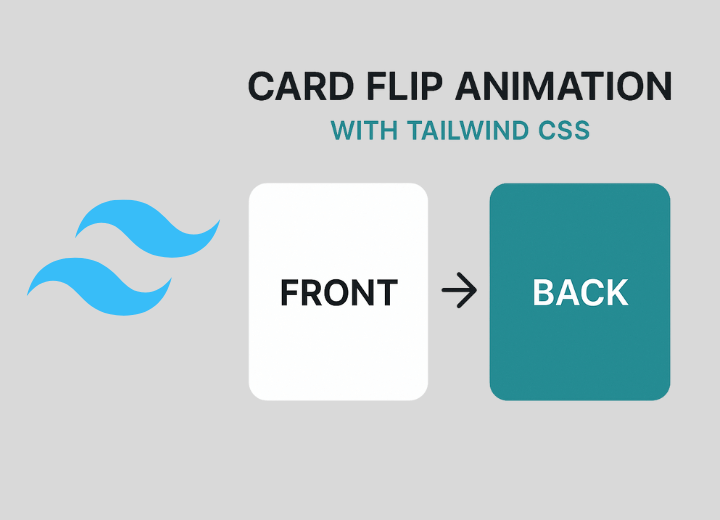
Yo, let's be real – card flip animations are fire. They instantly make your site look way more polished and interactive. Whether it's a portfolio showcasing your work, an e-commerce site displaying products, or a team page introducing your crew, flip cards hit different.
Here's the thing: you don't need some bloated JavaScript library or crazy complex code to pull this off. With Tailwind CSS and a tiny bit of vanilla JavaScript, you can create smooth 3D card flips that'll impress your users and keep your codebase clean.
In this guide, I'm gonna walk you through two powerful techniques: hover flips (automatic and elegant) and click flips (user-controlled). Plus, I'll show you how to use AI to generate production-ready components. Let's get into it.
Why Card Flips Matter
Card flip animations aren't just eye candy – they serve a real purpose:
- • Better UX: They reveal information progressively without cluttering your interface
- • Engagement: Interactive elements keep users on your page longer
- • Professional Polish: Smooth animations show you care about details
- • Performance: Pure CSS = no JavaScript bloat, instant loading
The Secret Sauce: CSS 3D Transforms
Before we jump into building, let's understand the three CSS properties that make this magic happen:
1. Perspective
perspective: 1000px defines your 3D viewing distance. Think of it like how far you're standing from the card.
2. Transform-style
preserve-3d keeps child elements in the 3D space, allowing them to rotate properly in 3D.
3. Backface Visibility
hidden hides the back of the card when it's rotated away – the key to the flip effect.
Technique #1: Hover Flip
This is the classic move – hover over the card and boom, it flips. Perfect for portfolios, team pages, or product showcases where you want that elegant, passive interaction.
Jane Doe
Full Stack Developer
About Me
Been building web apps for 5+ years. Love working with React, Node, and all things JavaScript. Always learning, always shipping.
Skills
👆 Hover to flip
HTML + Tailwind
<div class="flip-card w-80 h-96">
  <div class="flip-card-inner hover-flip">
    <!-- Front -->
    <div class="flip-card-front bg-white rounded-3xl shadow-2xl overflow-hidden">
      <div class="h-1/3 bg-gradient-to-r from-cyan-500 to-blue-500 p-6">
        <!-- Header content -->
      </div>
      <div class="p-6 flex flex-col items-center">
        <h2 class="text-2xl font-bold text-gray-800">Jane Doe</h2>
        <p class="text-gray-500 text-sm">Full Stack Developer</p>
      </div>
    </div>

    <!-- Back -->
    <div class="flip-card-back bg-gradient-to-br from-violet-500 to-indigo-600 rounded-3xl shadow-2xl p-8">
      <h3 class="text-white text-2xl font-bold mb-4">About Me</h3>
      <p class="text-white/90">Your bio here...</p>
    </div>
  </div>
</div>
CSS (add to your stylesheet)
.flip-card {
  perspective: 1000px;
}

.flip-card-inner {
  transition: transform 0.7s;
  transform-style: preserve-3d;
  position: relative;
  width: 100%;
  height: 100%;
}

.flip-card:hover .flip-card-inner.hover-flip {
  transform: rotateY(180deg);
}

.flip-card-front,
.flip-card-back {
  backface-visibility: hidden;
  -webkit-backface-visibility: hidden;
  position: absolute;
  width: 100%;
  height: 100%;
}

.flip-card-back {
  transform: rotateY(180deg);
}
Technique #2: Click Flip
Want users to control the flip? Click is your move. This works great on mobile where hover doesn't exist, and it gives users explicit control over what they see.
Alex Chen
UI/UX Designer
👇 Click to see more
What I Do
- ✓ 4+ years designing interfaces
- ✓ Adobe & Figma expert
- ✓ User research fanatic
- ✓ Mobile-first thinker
👆 Click to flip
HTML + Tailwind
<div class="flip-card flip-card-click w-80 h-96 cursor-pointer">
  <div class="flip-card-inner">
    <!-- Front -->
    <div class="flip-card-front bg-white rounded-3xl shadow-2xl">
      <!-- Your content -->
    </div>

    <!-- Back -->
    <div class="flip-card-back bg-gradient-to-br from-emerald-500 to-teal-600 rounded-3xl p-8">
      <!-- Your content -->
    </div>
  </div>
</div>
JavaScript
document.querySelectorAll('.flip-card-click').forEach(card => {
  card.addEventListener('click', function() {
    const inner = this.querySelector('.flip-card-inner');
    inner.classList.toggle('flipped');
  });
});

// Add this CSS class
.flip-card-inner.flipped {
  transform: rotateY(180deg);
}
Technique #3: AI-Generated Components
Want fully-typed, accessible React or Vue components with zero headaches? Use Claude AI, ChatGPT, or Cursor to generate production-ready flip card components in seconds.
Why AI for Components?
- ⚡ Speed: Generate a full component in seconds instead of an hour
- 📘 TypeScript ready: Proper types, interfaces, and PropTypes included
- ♿ Accessible by default: ARIA labels, keyboard navigation, screen reader support
- 📱 Mobile-friendly: Handles hover on desktop, tap on mobile automatically
- ✨ Production quality: Edge cases, error handling, and best practices built in
📝 Prompt #1: React + TypeScript
Copy and paste into Claude AI or ChatGPT:
React Component Prompt
Build a reusable React flip-card component using Tailwind CSS.

Requirements:
- Export a <FlipCard front={...} back={...} /> component that accepts React nodes for front and back content.
- Smooth 3D flip animation on hover and keyboard focus (spacebar/enter to flip).
- Support controlled flip via isFlipped prop and onFlip callback.
- Demonstrate usage with a responsive 3-card grid showing different content.
- Include full TypeScript types.
- Accessibility: keyboard operable, ARIA labels, aria-expanded, and screen-reader friendly.
- Mobile-friendly: detect touch and use tap-to-flip instead of hover.
- Include setup instructions for Vite or create-react-app.
📝 Prompt #2: Vue 3 + Composition API
Copy and paste into Claude AI or ChatGPT:
Vue Component Prompt
Create a reusable Vue 3 flip-card component using the Composition API and Tailwind CSS.

Requirements:
- Component: FlipCard.vue with props frontContent, backContent, initialFlipped.
- Support v-model:isFlipped for two-way binding.
- Emit 'flip' event when card is flipped.
- Smooth 3D perspective animation. Mobile-friendly: hover to flip on desktop, tap on mobile.
- Demonstrate in a parent component with responsive grid of 3 cards.
- Full accessibility: keyboard (spacebar/enter), ARIA attributes, visible focus outline.
- Include TypeScript support and Vite integration instructions.
- Code comments explaining the flip mechanism.
🚀 How to Use These Prompts
- 1. Click "Copy Prompt" to grab the text
- 2. Go to claude.ai, ChatGPT, or Cursor AI chat
- 3. Paste the prompt and let AI do its thing
- 4. Copy the generated component code directly into your project
- 5. Customize as needed and ship it 🚀
📦 What You'll Get
✨ React Component
- ✓ TypeScript types included
- ✓ 3-card responsive grid demo
- ✓ Hover & keyboard controls
- ✓ Mobile tap-to-flip
- ✓ Full setup guide
✨ Vue Component
- ✓ Composition API setup
- ✓ v-model:isFlipped binding
- ✓ Scoped CSS animations
- ✓ Parent demo with grid
- ✓ TypeScript ready
Pro Tips
✅ Do This
- • Keep cards the same size
- • Use 0.6-0.8s transitions (smooth)
- • Test on real mobile devices
- • Add visual hints (pointer, text)
- • High contrast on both sides
- • Include browser fallbacks
❌ Avoid This
- • Super fast animations (<0.3s)
- • Too much text on either side
- • Hover-only on mobile sites
- • Inconsistent card dimensions
- • Auto-flipping cards
- • Low contrast text
Hover vs. Click: Which One?
Use Hover When:
- • Desktop-focused designs
- • Portfolio/team showcases
- • You want passive interactions
- • Image galleries with details
- • Professional dashboards
Use Click When:
- • Mobile-first designs
- • Hiding pricing/details
- • You want user control
- • App-like interfaces
- • Lots of text on both sides
Want More Card Variations?
We've got a whole collection of card components – minimal cards, neobrutalist cards, glassmorphism, and more. Everything copy-paste ready.
Browse All Card ComponentsFinal Thoughts
You've got three solid approaches to build card flip animations now – hover flips for elegance, click flips for control, or AI components for production power. Pick the one that fits your vibe.
The code we covered is production-ready, so grab what you need and make it your own. Experiment with colors, timing, and content. Have fun with it.