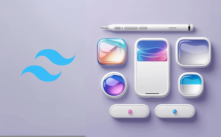
The world of user interface design is constantly evolving, and Apple's iOS 26 has introduced one of the most captivating design trends we've seen in years: Liquid Glass Buttons. These ethereal, translucent elements seem to float on your screen like droplets of liquid mercury, creating an almost magical user experience that feels both futuristic and surprisingly intuitive.
If you've ever wondered how to recreate these mesmerizing buttons for your web projects, you're in for a treat. Today, we're diving deep into the art of crafting iOS 26-inspired liquid glass buttons using the latest Tailwind CSS 4 framework.
What Makes Liquid Glass Buttons So Special?
Liquid glass buttons aren't just another design trend – they represent a fundamental shift in how we think about digital interfaces. These buttons combine several visual techniques that our brains find naturally appealing:
Glassmorphism meets fluid dynamics
The translucent nature creates depth without overwhelming content beneath them.
Micro-interactions that feel alive
Gentle animations mimic liquid physics for satisfying user feedback.
Visual harmony
Works beautifully with both light and dark themes.
Understanding the Magic Behind These Buttons
These buttons look amazing because they use a few clever CSS tricks:
- Blurred backgrounds: The
backdrop-blur-lgmakes everything behind the button look softly blurred, like frosted glass. - See-through colors: Using
rgba(255,255,255,0.15)creates that translucent look where you can see through the button. - Subtle borders: Light borders like
border-white/15give the buttons that glassy edge. - Smooth animations: Hover effects like
hover:-translate-y-0.5make buttons gently lift when you mouse over them.
Easy Button Styles to Copy
Let's look at each button style and see exactly how to use them in your projects.
1. Primary Button (Main Action)
This is your main button - use it for important actions like "Sign Up" or "Buy Now". It has the strongest glow and stands out the most.
<button class="px-5 py-2.5 rounded-lg text-white font-medium border border-white/15 backdrop-blur-lg shadow-lg bg-[rgba(255,255,255,0.15)] hover:-translate-y-0.5 active:scale-95 transition-all duration-300">
    Primary
</button>2. Secondary Button (Less Important Actions)
This button is more subtle - perfect for actions like "Learn More" or "Cancel". It has less opacity so it doesn't compete with your main button.
<button class="px-5 py-2.5 rounded-lg text-white/90 font-medium border border-white/10 backdrop-blur-lg shadow-md bg-[rgba(255,255,255,0.08)] hover:-translate-y-0.5 active:scale-95 transition-all duration-300">
    Secondary
</button>3. Tertiary Button (Very Subtle)
The most subtle button with barely any background. Great for links or less important actions that still need the liquid glass look.
<button class="px-4 py-2 rounded-lg text-white/80 text-sm font-medium border border-white/5 backdrop-blur-lg shadow-sm bg-[rgba(255,255,255,0.04)] hover:-translate-y-0.5 active:scale-95 transition-all duration-300">
    Tertiary
</button>Special Button Shapes
Rounded Pill Button
Perfect for friendly actions like "Get Started". The rounded shape feels more welcoming and modern.
<button class="group flex items-center justify-center gap-2 px-5 py-2.5 rounded-full text-sm font-medium text-white/90 border border-white/10 backdrop-blur-lg shadow-md transition-all duration-300 ease-out bg-[rgba(255,255,255,0.08)] hover:-translate-y-0.5 active:scale-95">
    Get Started
</button>Floating Action Button
A circular button that really stands out. Great for main actions like "Add" or "Create". This one has a blue tint to make it even more noticeable.
<button class="group flex items-center justify-center w-12 h-12 rounded-full text-white border border-blue-400/20 backdrop-blur-lg shadow-lg transition-all duration-300 ease-out bg-[rgba(59,130,246,0.25)] hover:-translate-y-0.5 active:scale-95">
    <svg class="w-5 h-5 transition group-hover:scale-110 group-hover:rotate-45" fill="none" stroke="currentColor" viewBox="0 0 24 24">
        <path stroke-linecap="round" stroke-linejoin="round" stroke-width="2" d="M12 4v16m8-8H4"/>
    </svg>
</button>
Small Icon Button
Small and compact, perfect for toolbars or when you need to save space. The icon grows slightly when you hover over it.
<button class="group flex items-center justify-center w-10 h-10 rounded-lg text-white/90 border border-white/10 backdrop-blur-lg shadow-md transition-all duration-300 ease-out bg-[rgba(255,255,255,0.08)] hover:-translate-y-0.5 active:scale-95">
    <svg class="w-4 h-4 transition group-hover:scale-110" fill="none" stroke="currentColor" viewBox="0 0 24 24">
        <path stroke-linecap="round" stroke-linejoin="round" stroke-width="2" d="M4.318 6.318a4.5 4.5 0 000 6.364L12 20.364l7.682-7.682a4.5 4.5 0 00-6.364-6.364L12 7.636l-1.318-1.318a4.5 4.5 0 00-6.364 0z"/>
    </svg>
</button>
How to Use These Buttons
Set Up Tailwind CSS 4
Make sure you have Tailwind CSS 4 installed. You'll need backdrop filter utilities enabled.
Copy and Paste
Simply copy any button code above and paste it into your HTML. They'll work right away!
Customize Your Way
Change text, adjust colors, or modify sizes to match your design. Examples are starting points.
Pro Tips for Perfect Results
-
Dark backgrounds work best:
These buttons really shine when placed over dark or gradient backgrounds.
-
Keep it simple:
Don't overuse - a few liquid glass buttons per page look premium.
-
Test on mobile:
Always test blur effects on actual devices for smooth performance.
-
Ensure readability:
Make sure button text has enough contrast against backgrounds.
Start Building Your Liquid Glass Buttons Today
Now you have everything you need to create stunning liquid glass buttons for your projects. Copy the code examples, experiment with different styles, and most importantly – have fun with it!
These buttons work great for modern websites, apps, and any project where you want to add that premium iOS 26 feel. Start with the basic primary button and gradually add more variants as you get comfortable with the technique.